
Making digital art feel analog
Yesterday, I wrote about the vintage, halftone-speckled aesthetic of the Ghost Box record label, which got me thinking about a larger art trend that's been on my mind: after the soulless minimalism of the 2010, the 2020s have so far been defined by lush, maximalist imagery. Puffy (sometimes barely legible) 70s typefaces, vivid colors, and layered imagery have replaced the razor-sharp sans-serifs and limited color palettes of the 2010s.
There's a lot you could say about post 2008 recession minimalism and how the pandemic made people sick of visual asceticism. (Though there are always exceptions to the rule.) But as someone who does art, I've been particularly interested in how that's translated into digital art and illustration.
But before I get to that, let's back up: Until last summer, I'd been using the free and open-source software Krita on my Windows Surface computer for years. Krita is an incredible program, though it's a bit less intuitive than Procreate, the app that it's probably safe to say that most artists use. But, to me, Procreate's killer feature is just the fact that it's so popular, which means that so many people create and sell brushes for it.
Procreate is cheap, especially compared to some other drawing programs (looking at Adobe here). It only costs $13 to purchase outright. But the problem is that it only runs on iPads, which are . . . pricey. Last summer (aided by a particularly good deal at Costco), I finally bought my first iPad and started using Procreate for art. (Usually paired with the also-excellent Affinity Designer or Affinity Photo for anything involving text or vector drawings; they're essentially lighter weight, cheaper, one-time-purchase alternatives to Adobe Illustrator and Photoshop.)
All of this is to say that once you start using Procreate, you start to get a sense of what brushes most people buy. Pretty quickly, I started recognizing that many of the most popular tools come from Retro Supply Co and True Grit Texture Supply.
As their names suggest, both companies specialize in nostalgic, gritty brushes and textures. (The current tagline on Retro Supply Co's homepage is "the analog tools your software is missing.") Their tools are great and easy to use, and they've become popular because the analog look is so in. Most of us draw on iPads now, but as a society, I think we're in a place where the last thing we want are slick, cold graphics.
If you look closely, you'll see that the "Corporate Memphis" images that big tech companies love to use have changed. If you're unfamiliar with the style, Corporate Memphis is the term for those boneless, brightly colored vector illustrations of humans that tend to appear on, say, sign-up screens for apps.
When the style started cropping up, it tended to feature flat expanses of bright color, maybe with a subtle gradient here or there. But nowadays, if you look closely, you'll see that they're now more likely to feature gritty shading, a subtle texture, and perhaps even slightly wobblier lines.
I tried to find real life examples of the change to show ya, but it seems like a lot of companies have phased out the much-reviled art style. But you can see it even comparing the art in this 2019 article about the style with the art in this 2021 article. It's a small change, but a significant one, and it's just one little nod to how people are responding better to more analog-inspired imagery.
(If you want to know more about the history of the Corporate Memphis art style, this YouTube video about "the world's most hated art style" is an excellent place to start.)
That's just one tiny detail that I've noticed. What's more obvious is what you see when you browse folks' art online. Once you've tried out different brush and texture packs, you develop and eye for them and start to scroll through Instagram and notice who's using what brush.
It's always a lot of fun to look at a piece of art and try to reverse engineer it, no matter the medium. And digital art is no different. Tons of artists are using retro, analog-inspired tools.
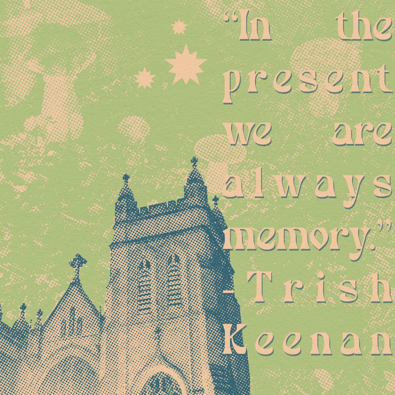
I talked about the halftones in some of Ghost Box records' album covers. It's also worth noting that the wonderful Hellebore magazine (which has incredible design and art direction) lives squarely in that 70s-inspired, halftone-heavy aesthetic as well.
I'm aware that a lot of my art plays with similar imagery. Especially the halftones—ever since True Grit Texture Supply finally released their Halftone Zine Machine image processing kit for Affinity Photo a few months ago, I've been delighting making in nostalgic halftone images. (The tool had previously been available for Photoshop and I'd been jealously watching other artists using it, so the moment it was released for Affinity, I pounced. And I'm sure I'm not the only one.)
But in addition to that, I have brushes that emulate pretty much every 2D medium (pencils, markers, pens, gouache, watercolor, etc.) I use textures like folded paper, digital glitches, cracked surfaces and grit, marble, various paper stocks with water stains and mold.
This trend goes beyond illustration and graphic design. If you go on YouTube right now and search "film like camera" or "film like photos," you'll find countless videos about making photos from digital cameras look like film. Many of them recommend older digital cameras, some of which are now pricey because of secondhand market demand. The price of film and development have skyrocketed, but the desire to make the digital look analog isn't new.
For years, people have been using apps like Huji Cam to get that 1990s-disposable-camera look. Heck, I even remember back in 2011, when I first signed up for Instagram, people mostly just used it for the filters. I remember processing pictures in Instagram so they looked more analog, downloading them, and then deleting them from Instagram and posting them elsewhere. At the time, it seemed like more of a photo editing app than a social media platform.
We clearly have a longstanding desire to make the digital look more analog, but it seems like it's heightened over time. It makes sense—it's often comforting to see images that we feel nostalgic about.
But like I wrote about earlier this week in looking at the Ghost Box record label, I particularly like the way the effect can be twisted to bring the viewer (or listener) both a sense of nostalgia but also a sense of strangeness and unreality—and even a nostalgia (or anemoia) for a time that never existed. It's cool to see new things created using the visual language of the past, allowing people to comment on and imagine different ways that things could be rather than just providing nostalgic imagery.
About the art in this post: I photographed the mushroom figurines and church while Randonauting in Queens, NY.